
Monthly Archives: March 2013
Buff Diagram
powerpoint
8 Typography
Typography is the balance and interplay of letterforms on the page—a verbal and visual equation that helps the reader understand the form and absorb the substance of the page content. Good typography establishes a visual hierarchy for rendering prose on the page by providing visual punctuation and graphic accents that help readers understand relations between prose and pictures, headlines and subordinate blocks of text. This division between structural logic and visual logic is reconciled through the use of cascading style sheets. Style sheets provide control over the exact visual style of headers, paragraphs, lists, and other page elements. But the greatest advantage of css is that it enables universal usability by giving you the ability to control the way your site looks in very different display circumstances. Many media are represented in the html and css specifications, but of those, “print” and “handheld” are the most widely supported. Print style sheets control formatting of pages when they are printed on paper, and handheld style sheets control formatting when pages are accessed using a mobile device. Consistency gives polish to a site and encourages visitors to stay by creating an expectation about the structure of a text.
Good typography depends on the visual contrast between one font and another, as well as among text blocks, headlines, and the surrounding white space. Margins provide important visual relief in any document, but careful design of margins and other white space is particularly important in web page design because web content must coexist on the computer screen with the interface elements of the browser itself as well as with other windows, menus, and icons of the user interface. Justified text is set flush with the left and right margins. Justified blocks of text create solid rectangles, and headings are normally centered for a symmetrical, formal-looking document. Text on the computer screen is hard to read not only because of the low resolution of computer screens but also because the layout of most web pages violates a fundamental rule of book and magazine typography. Each typeface has a unique tone that should produce a harmonious fit between the verbal and visual flow of your content. Typefaces such as Georgia and Verdana were designed specifically for legibility on the computer screen; they have exaggerated x-heights and are very robust compared to more traditional typefaces in the same point size. Studies have shown that Readers like large type more than most designers do and generous leading is a key to legibility.
Adding display type to a document will provide landmarks to direct the reader through your content. Italicized text attracts the eye because it contrasts in shape from body text. Boldface text gives emphasis because it contrasts in weight from the body text. To emphasize text—for example, in headings or key phrases within text—so that it won’t be overlooked, use bold formatting as well as color. Words set in all capitals should generally be avoided—except perhaps for short headings—because they are hard to scan. Plain html text is best for typography because it provides the most flexibility across many display media, allows quick editorial changes, improves search engine visibility, and facilitates universal access.
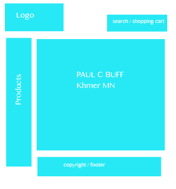
6 Page Structure
Clear patterns and use expectations are emerging from this adolescent stage of web publishing. With “web standards” methods for building sites, with carefully validated and universal accessibly xhtml and css, we now have excellent technical standards. Site design is the point at which you assemble your planning work on information architecture, navigation elements, and user interface wireframes and begin to structure it. Any site design should consider the larger design norms and user expectations of the web and avoid self-indulgent exercises in interface or design novelty.l site inhtml and css. If you work within a larger organization, always make your relationship to the larger enterprise a clear and meaningful part of your site design. If your institution has an identity program or a web template system, use it. Adopting the design standards of the larger enterprise can save you a lot of time and money.
Although not all web pages share the exact layout and features described here, most web pages incorporate some or all of these basic components, in page locations that have become familiar to web users. Headers are the most visible component of site identity. Headers provide site identity and global navigation, with search and perhaps other tools. Placing your organization or site logo in the upper left corner of the page—and linking that logo to the home page—is a widely used convention. The ideal arrangement is to use an html list of links, styled with css to spread horizontally across a section of the header. This gives you usability, semantic logic, accessibility, and search visibility. When using tabs, be sure you get the graphic details right: the selected tab should be graphically unambiguous, and the remaining tabs should clearly be behind the selected tab. The upper right area of the header is a popular location for search boxes, but a header search box must necessarily be simple to fit in this relatively small area. Scan columns are also useful as locations for web search boxes, mailing address and contact information, and other more minor but necessary page elements. If you sell a product or service, don’t hide from your customers, display your contact information in a prominent location, such as the scan column, on every page. The content areas of the site includes page titles breadcrumb navigation, rules, paging navigation, and dates. Page footers are mostly about housekeeping and legal matters such as copyright statement, contact details, links to related sites of larger enterprise, or page author.
The home page is important, but the home page is inherently singular and has a unique role to play. Your internal page template will be used hundreds or thousands of times across larger sites, and the navigation, user interface, and graphic design of the internal pages will dominate the user’s experience of your site. In larger sites containing a variety of content, your internal page template may be a set of templates that vary in details, such as the number of columns, to accommodate the range of content and user interface needs. Secondary page templates help create a concrete sense of the vertical dimension of sites and may perform varied functions in the tiers between the home page and the internal content pages. Designing the home page layout last allows you to acknowledge the unique introductory role of the home page but places the design firmly within the larger navigational interface and graphic context of the site. The homepage should have four primary elements: identity, navigation, timeless, or content focus, and tools.
 laurencastellana365