original site
This is my website right now, I have pretty much already organized all the work I want to show.
Site 2
Selfie
My name is Lauren Castellana and I am an artist. Mainly, my focus is set to photography. My artwork leads itself to being an experimentation of the tradition use of image making. I like to use alternative processes to create new work that pushes the limits of photography. Using blur and motion to create movement throughout my work, an off sense of tension and conflict occurs.
I will soon be graduating from Towson University and moving on into the real world. Right after college I plan on traveling across Europe awhile, which will broaden my horizons a bit. After that, I will work and get as many internships as I can before going to grad school. In grad school, in my career, and in life, I plan on pursuing the photographic arts.
Tree Diagram

Zone Diagram
Projects
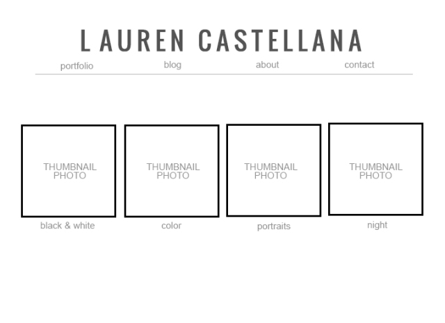
Color Portraits 2011- These images are apart of a series that experiments with altering the notion of the “standard portrait”. With long exposures, multiple flashes of light, and colored gels, these photographs turn into a whimsical flow of color and bodily distortion.
Night 2009- Taking long exposures at night creates bright streaks of found lighting that cannot be seen with the human eye. Colorful lights in front of a deep black background give the illusion of light that we cannot see.
Portraits 2010-2012- This section has some conventional portraits with some very unconventional approaches.With different forms of lighting, different moods and feelings can be achieved.
Black & white 2011-2012- These photographs explore how black and white imagery can push the boundries of traditional image making. The simplicity of the tones leads itself to creating very impactful imagery.
New site re-design

I decided to change my site to Pita Pan, a local carry out/restaurant. This site is less complex and is actually managable for me to re-design.
7 Page Design
The spatial organization of graphics and text on a web page can engage users with graphic impact, direct their attention, prioritize the information they see, and make their interactions with your web site more enjoyable and efficient. Visual and functional continuity in your web site organization, graphic design, and typography are essential to convince your audience that your web site offers them timely, accurate, and useful information. When considering page design, look beyond the typical display screen and anticipate designs for other contexts, including print and mobile. With adaptive design, the source document contains all necessary information and functionality, and media style sheets adapt the source document for use in different contexts. With adaptive design, we create a different external style sheet for each context and then reference the style sheet using the “media” attribute of the <link> tag. Document order is the sequence in which elements, such as site identity, navigation, primary content, related content, and provenance information, appear in the document source code. Another aspect of document design is including elements that are relevant to different contexts and coding the document to allow elements to display or not, as appropriate. For some, the web is a direct medium where pages are read online—on a large computer display, a small portable device, or read aloud by software.
The primary purposes of graphic design are to create a clear visual hierarchy of contrast, so you can see at a glance what is important and what is peripheral, Define functional regions of the page, Group page elements that are related, so that you can see structure in the content. A consistent approach to layout and navigation allows users to adapt quickly to your design and to predict with confidence the location of information and navigation controls across the pages of your site. You will need to strike an appropriate balance between attracting the eye with visual contrast and providing a clear sense of organization, through the variations in contrast that result from proper proximities, groupings, figure-ground relationships, and headings. Color palettes chosen from nature are an almost infallible guide to color harmony, particularly if you are not a trained graphic designer. Subtle, desaturated colors make the best choices for backgrounds or minor elements. Prefer the conventional over the eccentric, never let the framing overwhelm the content, and remember that the best style is one that readers never notice—where everything feels logical, comfortable (even beautiful) but where a heavy-handed design never intrudes on the experience. Unlike a printed document fixed on paper, the look of a web page depends on such elements as the display size, resolution, and color settings, the height and width of the browser window, software preferences such as link and background color settings, and available fonts. Determining the proper length for any web page is a balance of four factors, the relation between page and screen size, the content of your documents, whether the reader is expected to browse the content online or to print or download the documents for later reading, the bandwidth available to your audience. A “signature” graphic and page layout allows the user to grasp immediately the purpose of the document and its relation to other pages. A good web template program establishes not just the visual look and feel of particular pages in the site but also specifies how regular patterns of xhtml, css, include files, and more complex application or content functionality will all merge using well-established, well-documented, and consistent standards throughout the site.
Wigs Diagram

 laurencastellana365